Fifa 2026 Wayfinding
In collaboration with City of Atlanta to build a kiosk for Fifa 2026
Industry Partnership
UX Strategy
UI Design
Accessibility
Usability Research
Rapid Prototyping
[2025]
Overview:
In partnership with the Atlanta Downtown Improvement District (ADID), this 10-week project reimagined the city’s outdated information kiosks to create a modern, intuitive, and accessible wayfinding experience. Designed to support a diverse audience ahead of the World Cup, the project focused on usability, clarity, and inclusivity.
I mentored the student design team throughout the project, helping them step into different leadership roles, guiding their approach to kiosk accessibility, and ensuring their concepts translated into a real kiosk that could be feasibly built.
Client: Atlanta Downtown Improvement District
Timeframe: 10 weeks
Industry: UX Design, Wayfinding, Branding
Role: UX Mentor
Number of students mentored: 10
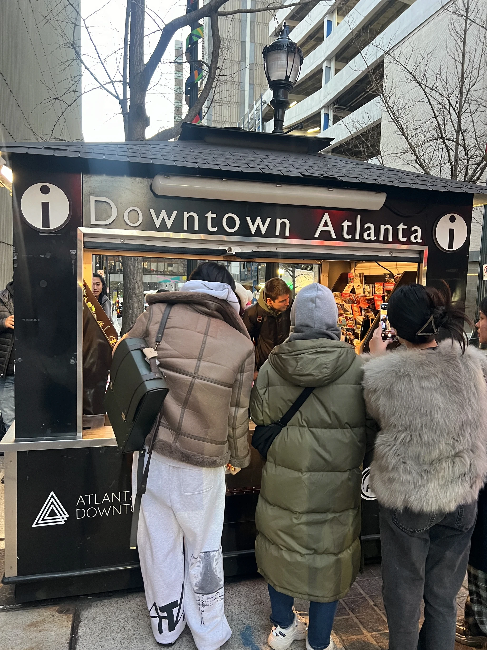
The ask from the city:
Redesigned the information booth, digital kiosk, and surrounding environment to optimize wayfinding, safety, and visitor experience for FIFA 2026 in one of downtown Atlanta’s busiest intersections, with scalability in mind for future expansion.
The expected outcome:
A comprehensive ecosystem of wayfinding and information services designed to support guests and ambassadors, enhancing the overall experience. This included branding, a digital kiosk, and an expansion plan for future growth
Why SCAD Recruited me?
SCAD recruited me to mentor students and guide them through the real-world design process I use in my work. I helped them bring their ideas to life by supporting the design and development of software, with a focus on design systems, kiosk accessibility, and journey mapping.
I also led portfolio reviews and design critiques to help sharpen their skills and elevate their projects.

How did we approach this project
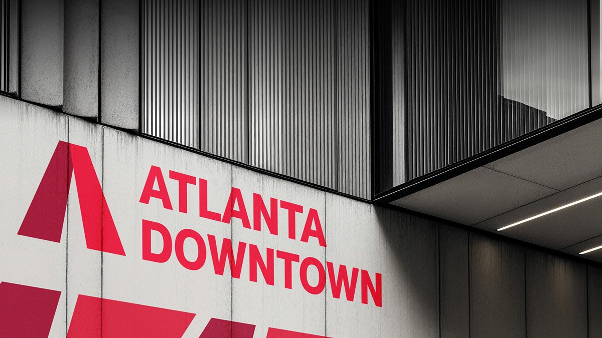
01. Recognization
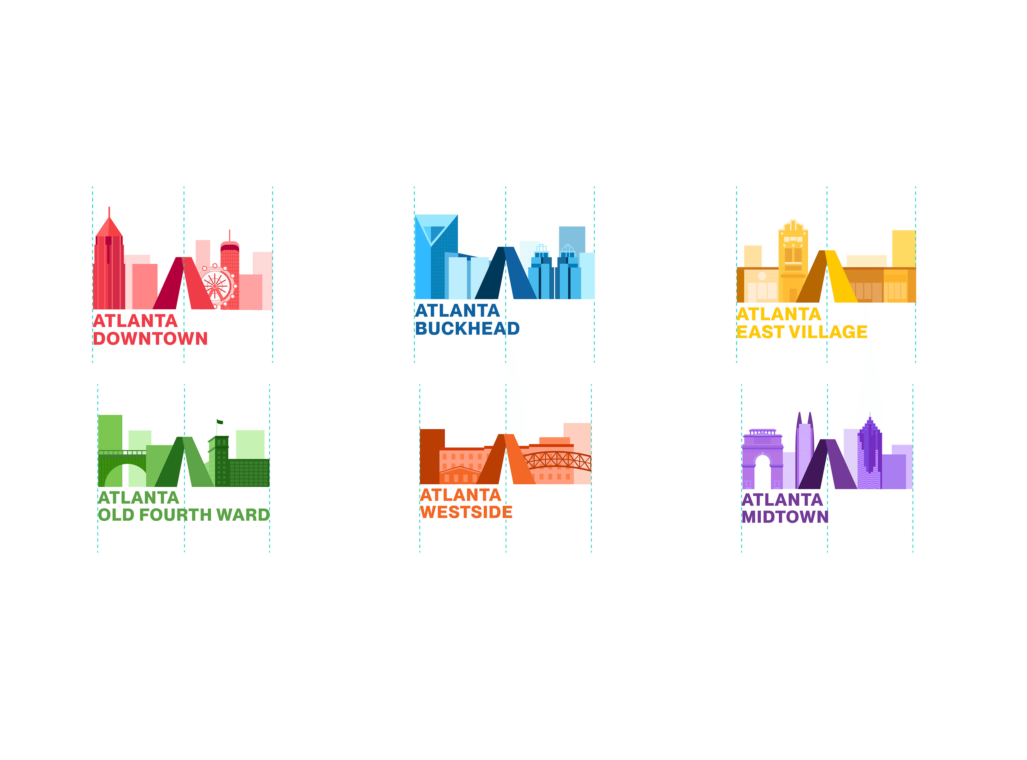
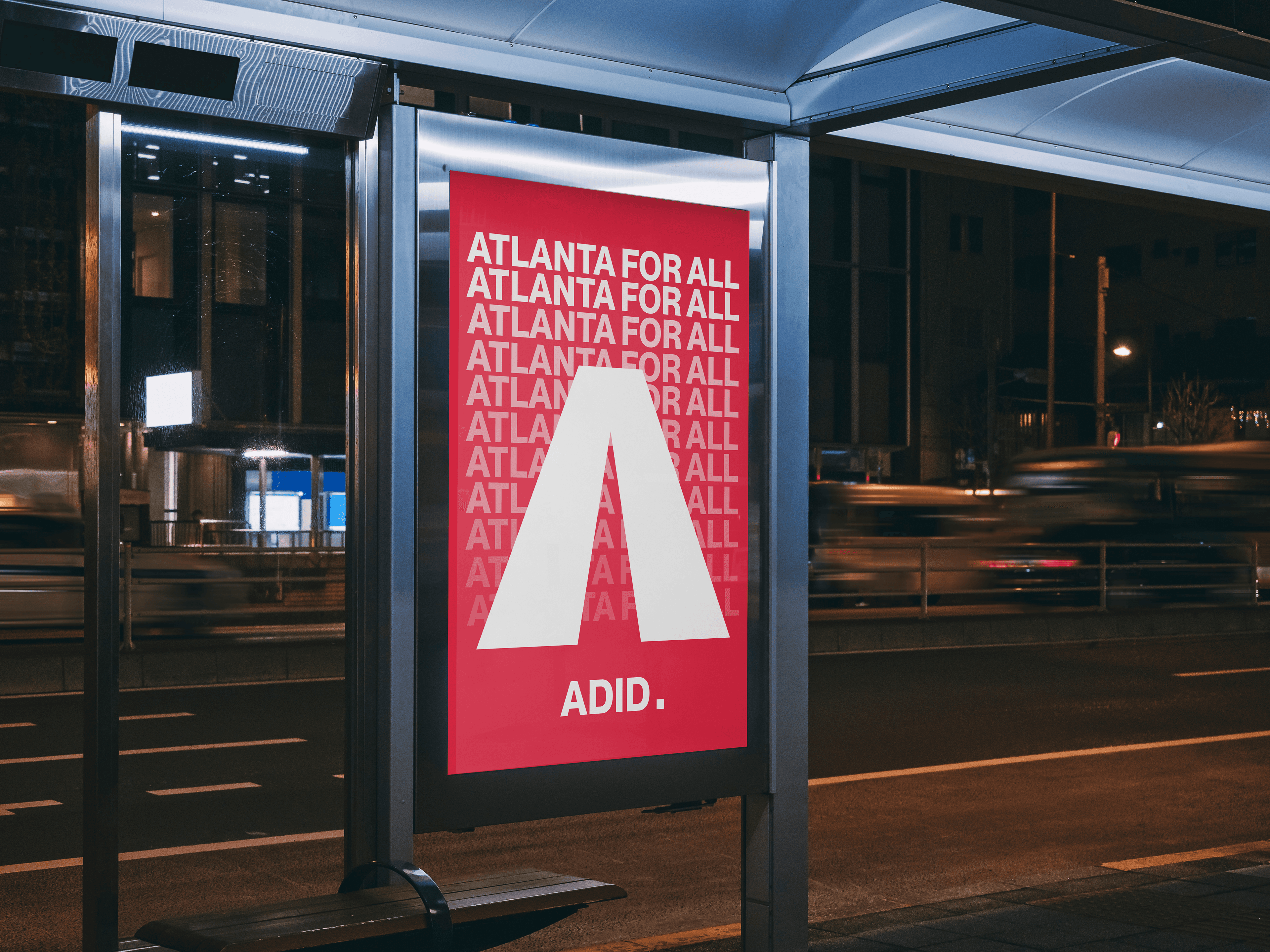
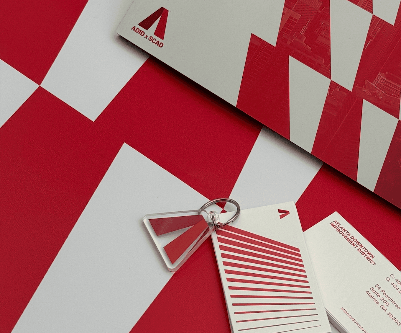
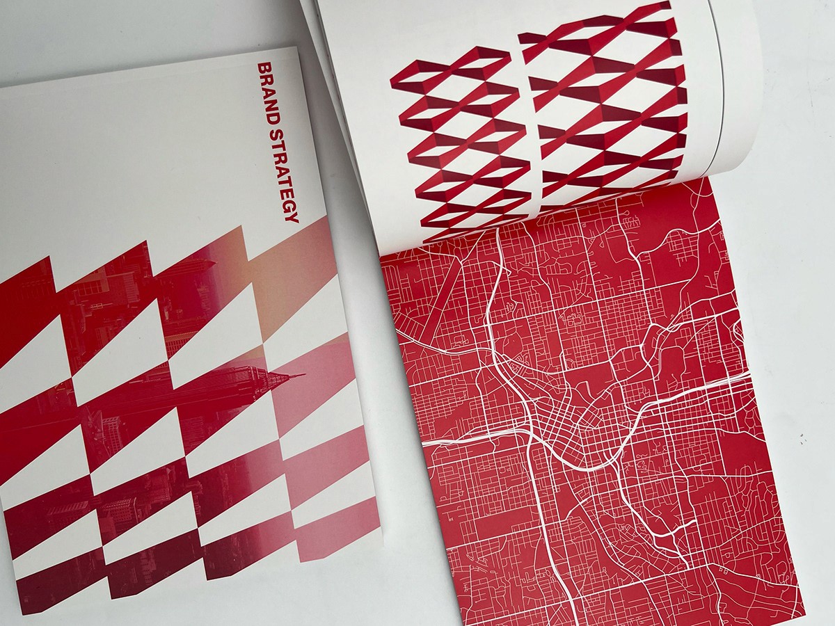
A flexible logo system with color variations tailored to each neighborhood
02. Engagement

Create a more inviting, intuitive, and accessible experience for visitors.
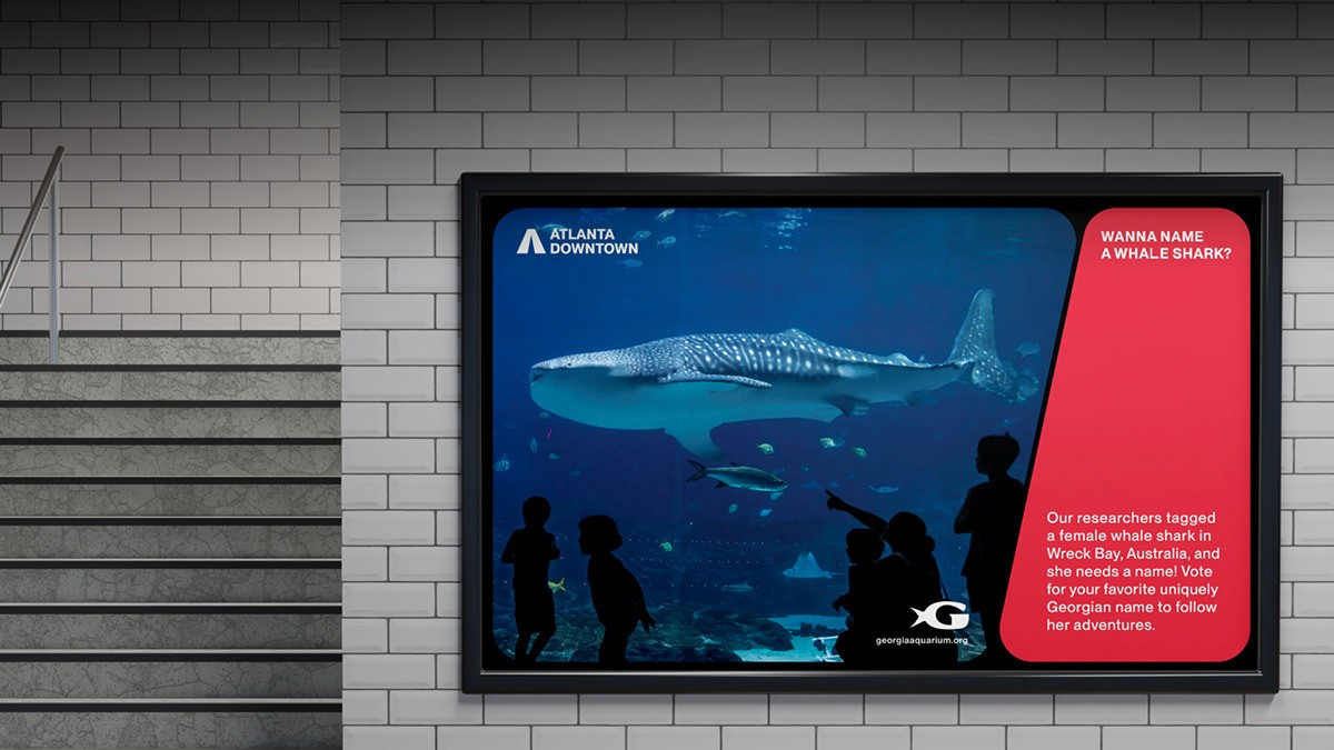
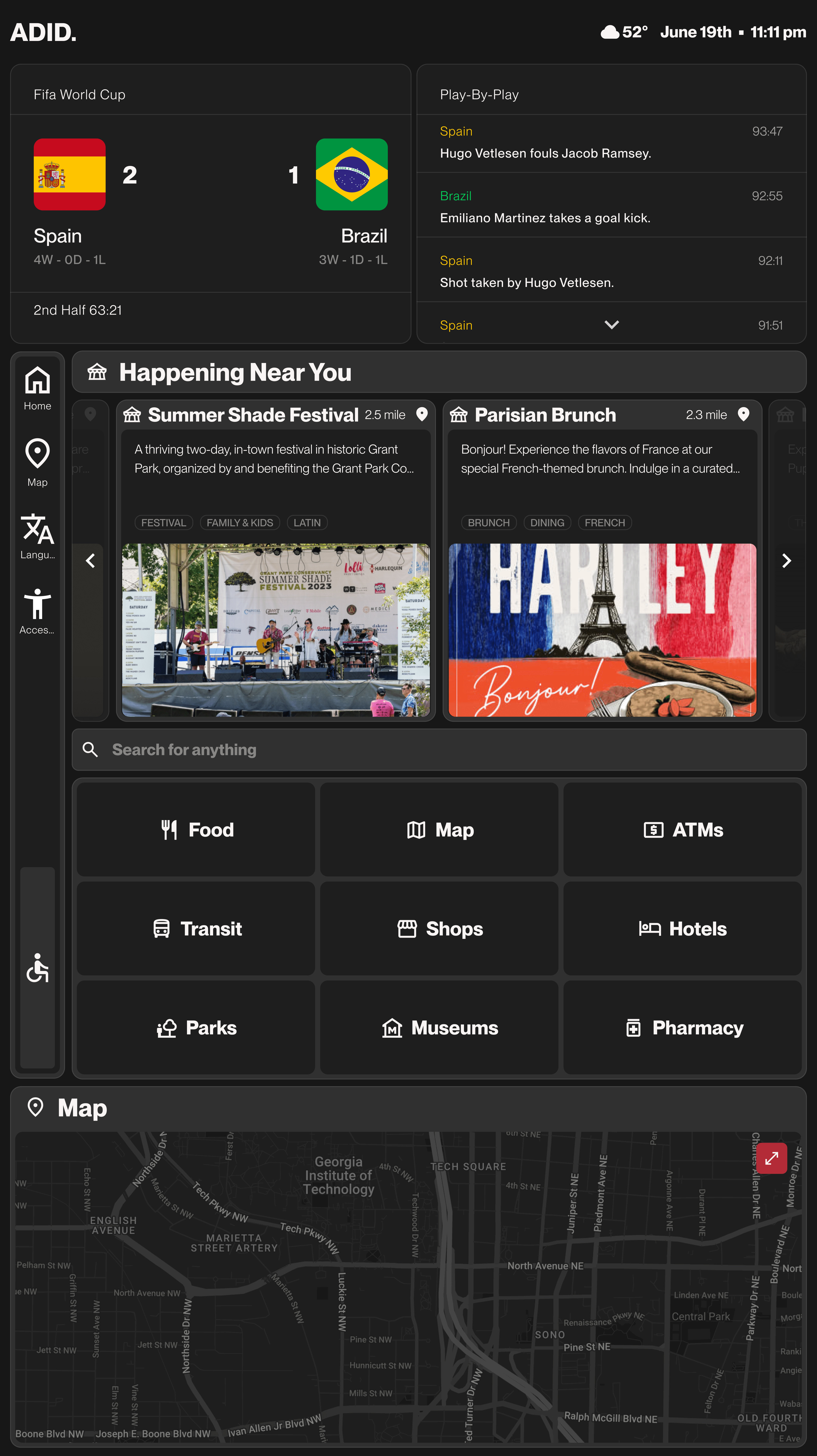
Digital Kiosk
Create the interface, ensuring it fits seamlessly into the environment next to the information desk.

Research Overview
To design kiosks that truly serve the city, we gathered insights from commuters, visitors, and locals through surveys, interviews, and observational studies. We studied 25 to 30 people at existing kiosks in downtown Atlanta and spoke with tourists, daily commuters, and local residents.
These findings shaped our design decisions and ensured every feature was based on real needs, especially as the city prepares for the 2026 FIFA World Cup.
What did we learn?

Visitors struggled to locate existing kiosks in busy downtown areas
Kiosks were hard to spot in crowded spaces, leaving many visitors unsure where to go for help.

Current interfaces lacked accessibility features for users with disabilities
Users with motor, visual, and auditory disabilities often faced barriers when using public kiosks. The absence of accessibility features prevented a large portion of the population from engaging with them.
What users currently expect from kiosks?
92% wanted maps and directions
63% wanted transportation schedules
52% wanted local events
What features users want is kiosks?
Users asked for real-time updates, accessibility options, translation services, information on nearby businesses, and QR codes for mobile access.
These insights provided a clear roadmap for our design process, allowing us to prioritize the most valued kiosk features. By directly addressing user preferences, we ensured our solutions were genuinely aligned with visitor expectations and city goals.
Brainstorming and exploration
Clear guidance that helps users navigate with confidence.
Universal Accessibility
Designed to work for all users, regardless of ability.
Live & Relevant Information
Timely updates keep users informed in the moment.
Frictionless Interaction
Simple, responsive actions with no unnecessary steps.
00. Things we kept in mind while designing


01. From sketches to high-fidelity screens


02. Validation Through Testing
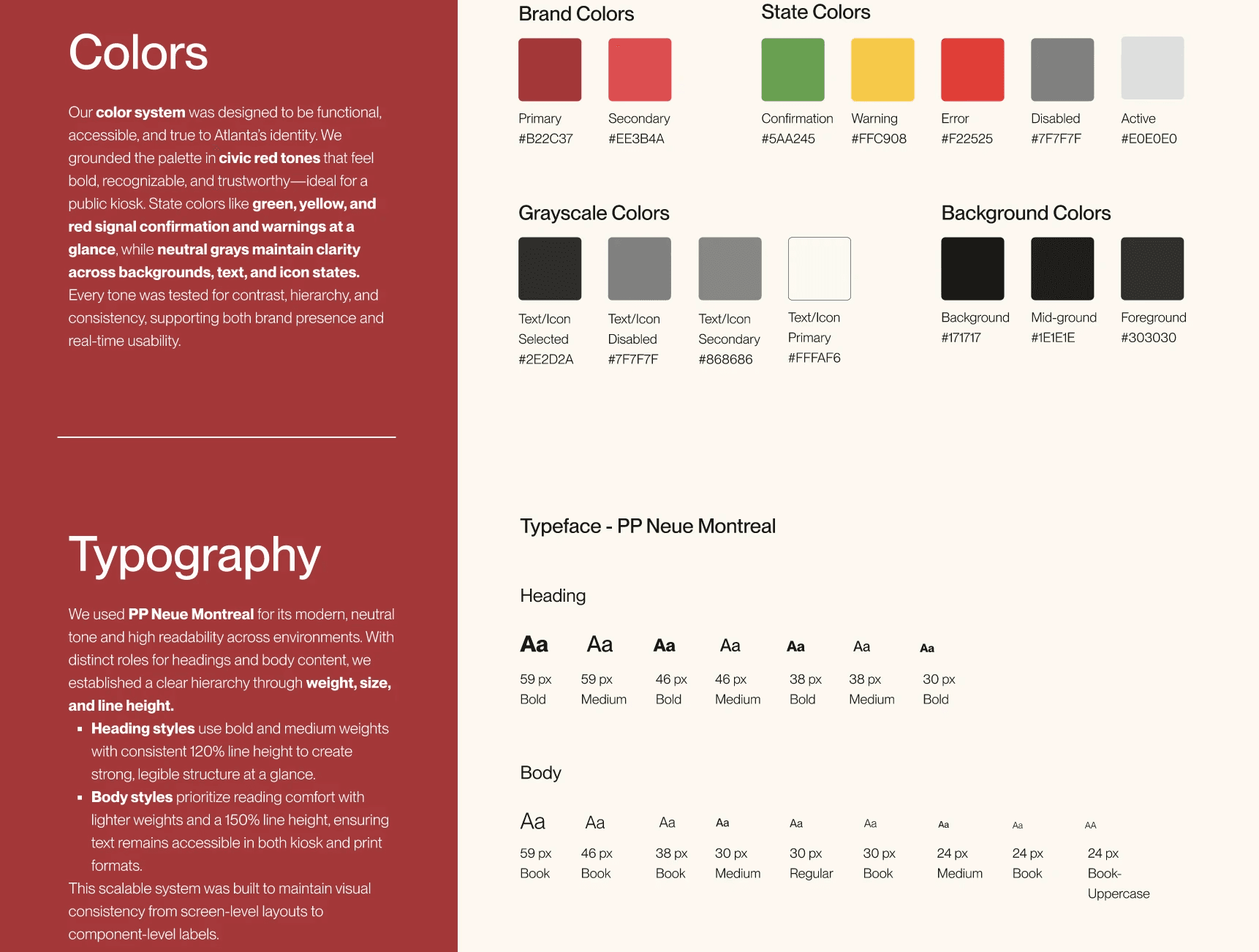
03. Design System & Branding
Final outcome
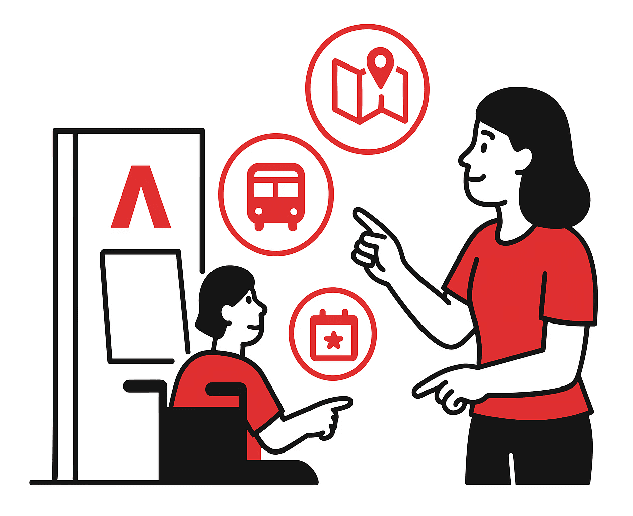
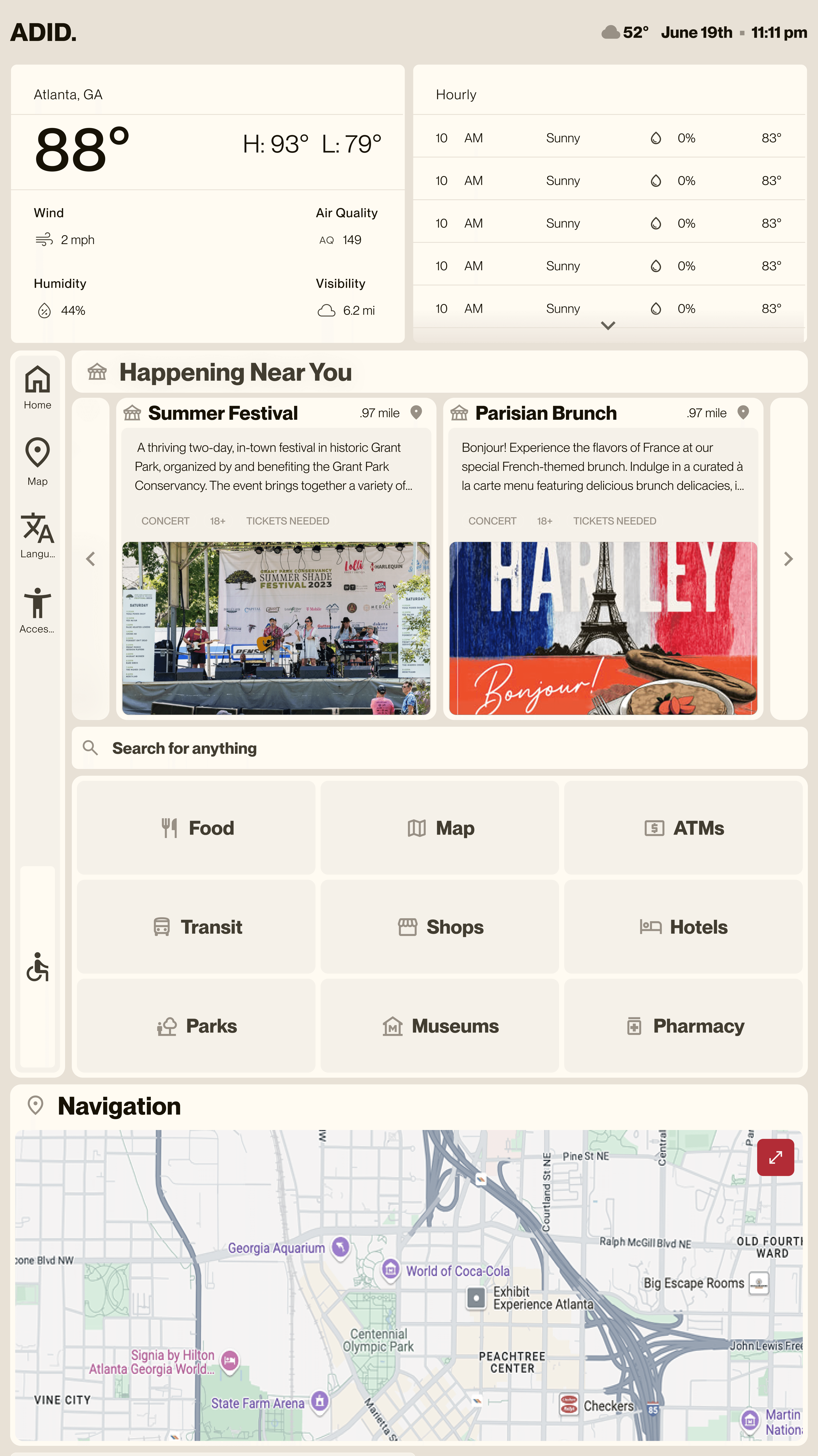
Home and Accessibility
Quick access to key destinations, live updates, and events. Built-in accessibility options like font sizing and wheelchair mode support inclusive use.
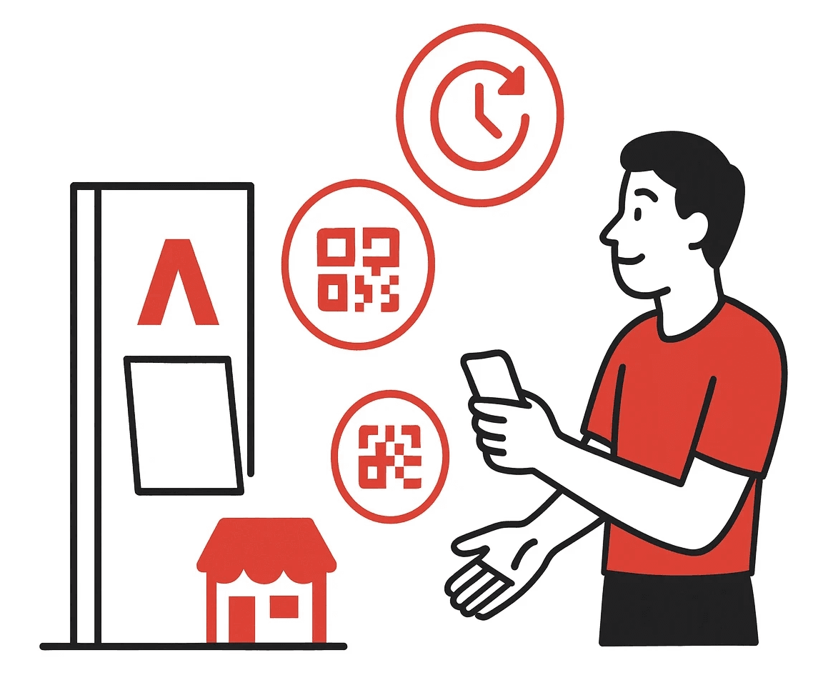
Transit & Map
Built for speed and clarity, this screen simplifies city navigation with live maps, key transit icons, and intuitive directions.
Documentation
With only 10 weeks to design and no involvement in engineering or implementation, we documented every screen in detail including spacing, colors, features, and configurations so that ADID’s third-party implementation team had the right specifications and everything needed to build successfully.


Designed for every context! From light mode to dark mode to FIFA-branded experiences
Kiosk & Information Booth


Redesigned to be approachable and practical, the new information desk features a modern layout, expanded storage, and improved visibility. Built with both staff and visitors in mind, the structure adheres to accessibility guidelines and height standards, ensuring ease of use for all. This design brings clarity, comfort, and inclusivity to the heart of downtown wayfinding.
03. Expansion
Brining it to life


Takeaways
This was my first time working with a team of over 10 designers, each with distinct roles, which challenged me to help keep everyone aligned and on track throughout the project.
I gained valuable experience collaborating across disciplines, working with vendors on physical kiosk specs, coordinating with the branding team to ensure visual consistency, and supporting the team in preparing a solution ready for real-world implementation. It was a true test of communication, organization, and cross-functional teamwork.
