Loyalty & Promotions
Enabling retailers to deliver personalized rewards and promotions directly at checkout
UX Design
UI Design
Discovery
Usability Testing
[2023 - 2024]

Overview:
Loyalty and promotions are at the core of modern retail. Every retailer designs unique programs to keep shoppers engaged, encouraging them to spend more time with the brand both in store and across digital touchpoints, ultimately strengthening customer relationships and increasing lifetime value.
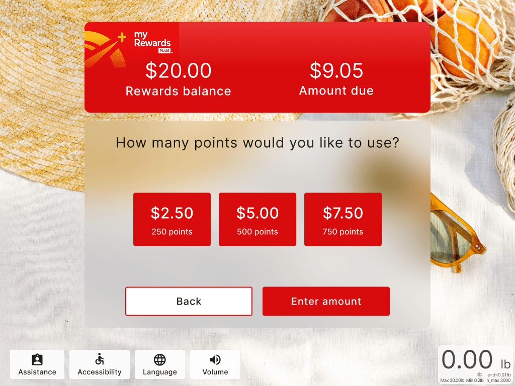
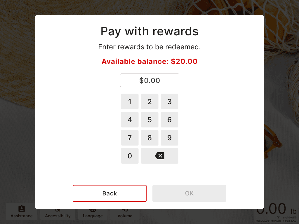
NCR’s legacy self checkout did not include loyalty as a built in capability, requiring retailers to develop their own custom integrations. As part of the next generation self checkout platform, we integrated loyalty and promotions directly into the base software. Retailers can now offer shoppers features such as item based discounts, fuel rewards, point collection and redemption, lottery and coupon participation, bill payments, pharmacy order refills, and personalized rewards, all seamlessly within the checkout experience.
Company: NCR Voyix
Timeframe: 7 months
Industry: Retail
Role: Product Designer
Project goals:
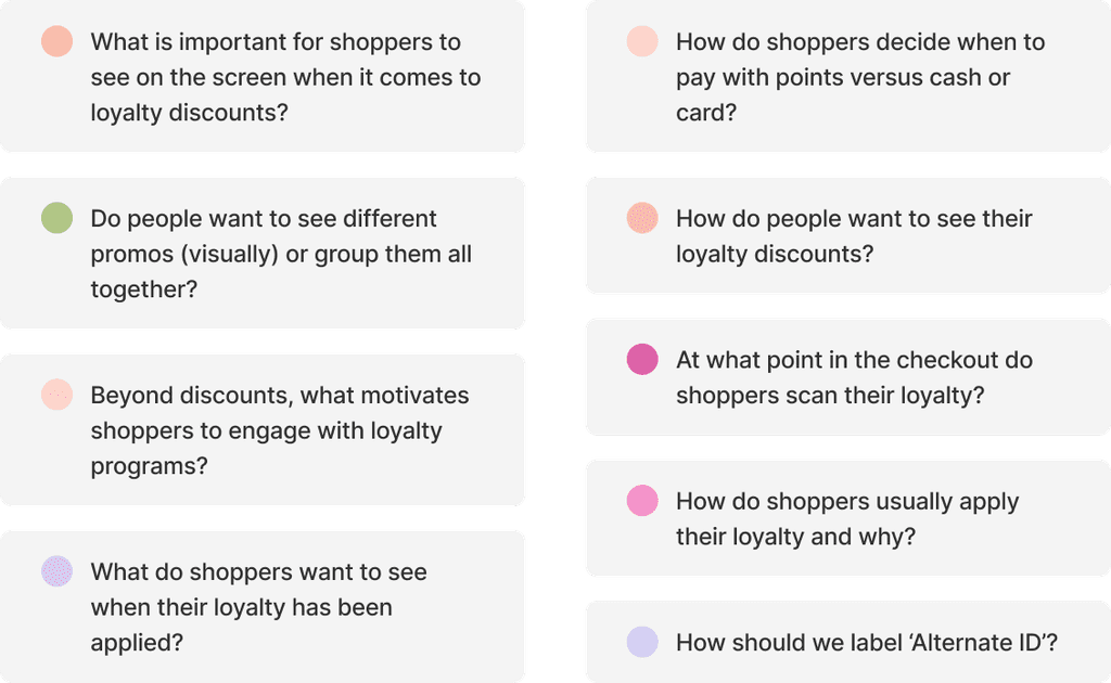
Our goal was to first understand how shoppers use loyalty programs and what common features they look for when they shop. At the same time, we wanted to uncover why some customers choose not to sign up and what barriers prevent them from engaging.
The objective was to design a personalized loyalty experience that encourages shoppers to take advantage of retailer offerings while balancing individual preferences with business goals.
My role:
I was the Product Designer on the team, collaborating closely with a researcher during the discovery and usability research phases. Together, we explored user behaviors, needs, and barriers around loyalty engagement.
I partnered with engineers to understand technical constraints and ensure our solutions were both feasible and scalable. I also worked with product managers to incorporate customer feedback and data collected over the years into our design decisions.
Our design process

Discovery
Surveys
We began by researching how other companies approach accessibility in self-service. As part of this, we reviewed audio navigation experiences at the Atlanta airport to understand current standards in assistive technology.
We focused on navigation logic, scripting style, and available controls to gather insights that shaped our own design decisions.


Usability Testing
Overview
Each page is divided into sections, with audio cues guiding users step-by-step to create a structured, intuitive experience.
Why? A section-based layout simplifies navigation for users with low or no vision, making the experience more accessible and easier to follow.
Usability research methods
The audio experience design starts with taking a given page, then that page is broken up into sections, and lastly section contents.
A page is set of contained sections from which to initiate or complete workflows.

Designs
Section-Based Layout
Each page is divided into sections, with audio cues guiding users step-by-step to create a structured, intuitive experience.
Why? A section-based layout simplifies navigation for users with low or no vision, making the experience more accessible and easier to follow.
Breaking down a page
The audio experience design starts with taking a given page, then that page is broken up into sections, and lastly section contents.
A page is set of contained sections from which to initiate or complete workflows.
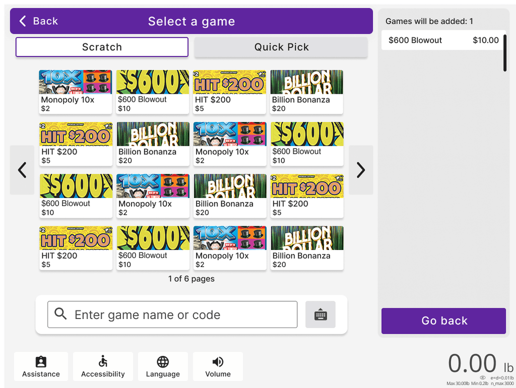
Applying Loyalty
The first step is to define the sections in the UI for each page and determine their order. This establishes the structure and flow, ensuring users can navigate the page intuitively and effectively.


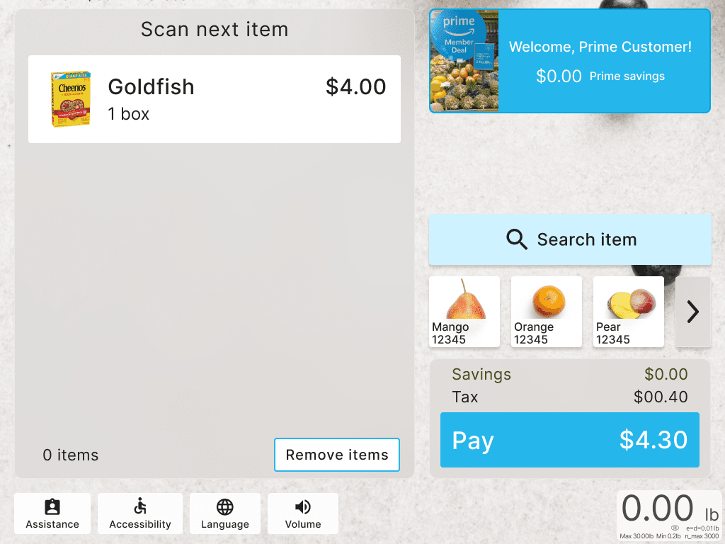

B. Item based discount
The next step is naming each section. Clear and descriptive names help ensure everyone understands the purpose of each section, making the navigation and implementation process straightforward.
- Configurable by Customers
- Adaptable Translation


C. Transaction level discounts
We categorize each section by its type, which directly impacts the instructions provided. Each section type comes with its own set of instructions, ensuring users receive the right guidance based on the section they’re in.
- Start of Page
- Informational Element
- 1 / 2+ options
- Items

D. Pay with points
We categorize each section by its type, which directly impacts the instructions provided. Each section type comes with its own set of instructions, ensuring users receive the right guidance based on the section they’re in.
- Start of Page
- Informational Element
- 1 / 2+ options
- Items

E. Lottery
Items: Cart, Quick add items, Picklist items
Options: All other selectable buttons.
Selectable vs Non-selectable: Sections can contain lists of non-selectable text elements that should still be navigable and part of a list scripting structure.
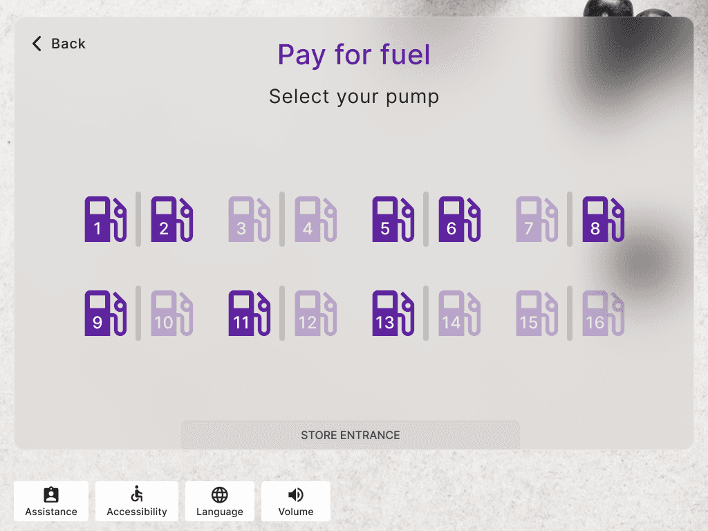
F. Fuel
Items: Cart, Quick add items, Picklist items
Options: All other selectable buttons.
Selectable vs Non-selectable: Sections can contain lists of non-selectable text elements that should still be navigable and part of a list scripting structure.
G. Pharmacy Refills
To ensure the user knows their selection was made, each button will give audio feedback after pressing the center key,
“[Button label] button selected”
followed by any new instructions based on the current navigation focus.
H. Bill Payments
To ensure the user knows their selection was made, each button will give audio feedback after pressing the center key,
“[Button label] button selected”
followed by any new instructions based on the current navigation focus.
Takeaways
This project gave me a deep appreciation for the role of accessibility in UX, something I hadn’t fully explored at SCAD. Working closely with real users helped me understand their needs and frustrations with digital kiosks, reinforcing the importance of designing inclusively.
I learned to prioritize frequent testing, gained insight into the architecture of self-checkout systems, and collaborated with engineers to build a complex experience from scratch. I also learned how to interpret accessibility requirements and work with a third-party auditor to complete a VPAT.
Most importantly, this project taught me to always consider accessibility in my design process, no matter what product I am working on.
